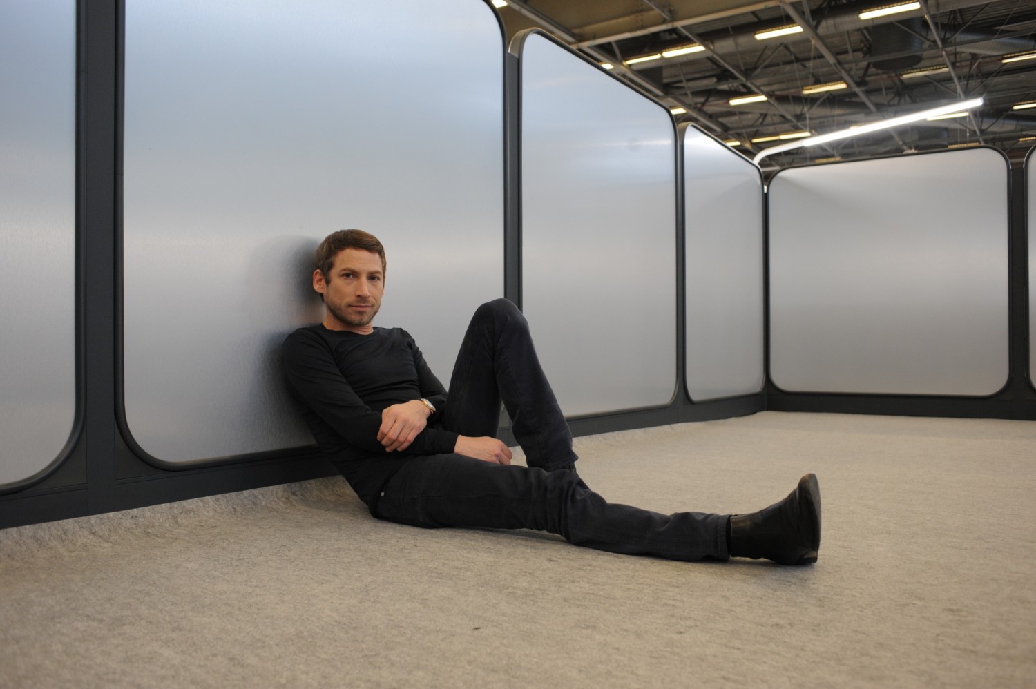
INTERVIEW ORA ITO
INTERVIEW ORA ITO — 07.02.2018
REALISATION PROJET STAND ET MOBILIER PREMIERE VISION
Ora Ito won the competition to create the new stand and furniture concept for Première Vision Paris.
What was your vision for this global event for the textile industry?
I’ve been familiar with the show for a long time, since the big revival of the French fashion industry in the late 1990s. For this new generation of designers that emerged in the late 90s, Première Vision was their show. That's when I discovered Première Vision. I was a spectator and I wanted to find my future focus.
It reminded me of my childhood, or rather my teens. I was 18 years old at the time, and I still wasn’t sure which creative field I wanted to express myself in. Today, textiles are used in design, fashion and architecture, so as a material it has taken on a much more important role in creation. So, it reminded me of that - the start of my adult life.
Does this show offer a vision of creativity? Is it a source of stimulation for designers?
This is the show where you go to shop for your collections. Obviously. You come to find inspiration, to see all the new innovations, and you get a very instinctive glimpse of what the big colours and materials are going to be in the future. It’s a great catalyst for everything that’s going on in the world of textiles and design.
Première Vision in three words?
Forerunner. Rendez-vous (for new textile) Intelligence.
You were chosen to redesign the show, a role previously played by Wilmotte, then Jourdan Avossa, and now you. What was the challenge for you and how did you approach it? Can you describe the architectural principle you created for the redesign of the Première Vision city?
First, the concept needs to last seven years. This is the first point, challenge and constraint you need to work with. That means you can’t take a particular stance or follow a trend, because it has to be absolutely timeless. Beyond being somewhere with its own personality, it needs to be fairly neutral, to merge into the background, so it lasts. That was the challenge: how to create a place that would look cool from one year to the next, in a world where things change so fast, where trends and fashions don’t last as long... Where time is very long and very short, and where you need to strike that balance.
How did you address this challenge? It's easily said, but in practice, how does it work?
I approached it the same way Jean Prouvé designed chairs, furniture and mobile architecture, from an engineering angle. In the end, the system is aways beautiful. A well-made system works well. Fine engineering, fine mechanics - it’s always beautiful and timeless. When you look at Jean Prouvé's designs, there is something timeless about them, precisely because they don’t match a style, they’re a response to the structure. I was really attached to the idea of structure, frame or framework which, in the end, becomes a system. We’ve gone past the stage where you put a wall on either side and partition the space to create a stand. We created a system, and that’s why the design will work even 20 years from now.
So, it’s a modular system, a technique and an assembly that can be used with different materials. It was an element that stood out in your design from the start because this metallic system can use other materials. Exactly, and it’s versatile and changeable, so you can use another material in this framework to adorn the walls. But it’s not just decorative, it’s structural, it has a real function. There is nothing unwarranted, superfluous or too much or little of any element. It strikes just the right note. GL and their partners also did an amazing job with the section manufacturing and executive production.
It seems like a technical, innovative approach intended to break with convention.
Not necessarily to break with convention. I wanted to create something new that reflects who I am, but also functional and therefore the best possible system for the people who are going to use these stands. They benefit from a modular system which they can use as an extension of their identity but within a strictly defined framework. The furnishings are neutral but they can blend in with their identity. It takes a combination of things to create a design that’s timeless, intelligent, functional, mobile, and easy to assemble, dismantle and store. The fact they can be stacked is part of their beauty. There is a certain logic.
So, you take a very functional, practical approach to users, whether visitors or exhibitors. You take a very practical approach to the show itself.
The materials are highlighted by the frames, which form the perfect setting for a material to create the streets. It’s like a city!
It’s a large-scale project. What was your approach to the Première Vision city, which takes up the whole of Paris Expo Villepinte?
It is a micro-city, a kind of medina, built on the same principle as New York, with its perpendicular streets. What is interesting about a good design is that there’s not much to say about it. The more you have to say, the more you stack ideas on top of one another, and in the end the less you have to say. This is about simplicity.
How does this simplicity translate visually from a global point of view?
In the most neutral, textured way possible, because the light reflects the material and creates something random and uncontrolled. Because it’s very controlled, it’s important to add a touch of imagination. And this imagination comes from the uncontrolled part, the reflection of light on the materials, etc.
The reflection on the materials was still complex because it had to have an aesthetic appeal and match the specifications.
It changed because of maintenance needs and neutrality. All these things are important. You have to be able to feel the quality. That is what we are highlighting. It is a quality object, not a preconceived idea of a stand.
This project has an overall design for the furniture and lighting.
What was your design approach to this new collection?
What interested me about the furnishings was, again, the idea of reusing the materials.
Yes, just to explain the background to this, the Jourdan Avossa design was covered in miles of Corian, and recycling it, and giving it a new lease of life, was one of the strengths of the design.
Exactly, and it’s part of the renewal behind my work. And I really liked this idea, because at one point in the presentation there was a diagram with the process of how we planned to recover the old stands, and bring it back to the workshop, fold it, transform it and return it. And it was really popular with the panel. Beyond the highly functional, timeless, modern aspect of my proposal, there was also this recycling aspect, which is almost obvious. You may not really be aware of it, but in the end it seems obvious.
It added to your solution and it helped with the furniture designs because your starting premise was a sheet.
Yes, of course, the folded sheet actually informs the design of all the furniture and the identity of the chairs, tables, cupboards... the whole line.
Light was also an important issue. As the displays centre on fabrics, how they are revealed by the light is crucial.
Yes, you need to integrate the light because it supports and even flatters the entire space. I tried to make sure that there were as few objects as possible and that everything is unitary to avoid confusion. You have to avoid causing confusion because there are so many elements the participants want to focus on - their brand, product, textiles, fabrics, colours, etc.
The design of the lamp is really powerful
This lamp, which is wonderful, is similar to the lamp I made for ARTEMINE for which I won quite a few prizes. It was the One Line, a lamp that has been copied a lot. The idea was to punctuate the space with a line that curves and signifies the space.
It’s a global line with a highly architectural approach to light, closely integrated into the overall system. Maximum simplification to benefit users.
At a given point, competing with so many talented people... I took it very personally. There were all the greatest names working in architecture and design today. So, for me, I didn’t approach it as a design competition where I needed to assert my identity. I wanted to understand the challenge of a show like this, how it could be used for seven years, and how we might make the assembly process a pleasure rather than a pain. How do you design a system that can be broken down, mobile and adapted to any layout? How do you integrate all the functions as much as possible so brands exist without imposing our identity on them while striking - and this is the hard part - an artful balance between being an identity-oriented, strong product with personality but also fairly transparent and minimalist?
How would you summarize your global approach?
As a system. It’s also about modularity, timelessness and above all integration, like in a car where everything is integrated, where the same object integrates the dashboard, the engine, etc. That was sort of the idea behind the project. Also, as I was saying, it was a reference to Jean Prouvé. I think it is the right reference because when you look at his work, it is devoid of style and embellishments, and you only see the system. And that's the beauty of the intelligence behind how these systems work.
Was this subject an unusual one for you? As far as your approach is concerned, dealing with the world of exhibitions as a whole...
It's something I had never done before. There are parts I am happier with than others, there are others which could be... Strictly speaking, I took a global approach.
As an exercise, was this more about architecture or urban planning or both?
For me, it was more like working on furnishings in a system. Not architecture, because the emphasis was more on lightweight structures rather than heavy things. It’s still about objects. More like smart large furnishings. Not even large furniture, smart systems. An object by itself is nothing. There is no one single object that comes to mind. If anything, it is the system as a whole that stands out. For me everything fits into the same system: you have a system of partitions and integration and different elements, fabric, lighting and all that... And then you have the mobile objects that are less restricted, with no section or mounting and plug systems, which also reflects this idea of recycling and therefore not losing what ought... For me it was unthinkable to lose kilos or tons of Corian.
There’s an awareness of sustainability and scale ?
Yes, and also reduction. We didn’t use more material than we needed, and that's interesting. It wasn’t about masonry. You understand that you are in a system. You accept that it needs to be mobile. You accept that you’re in a place that is not set in stone and will change and host other events. That's interesting too.
You really invented this weft that has a textile quality. Is it like a mesh you've squared off?
That wasn’t really me. It was more or less imposed. But let's just say that we strengthened this weft or matrix aspect.
If tomorrow PV opens a second department or another area of the show, it can be displayed in a different skin. Does this system allows us to create a neighbourhood?
Just use wooden panels instead of metal or concrete and it's completely different. It has a cameleon-like quality and can change its appearance from one moment to the next.
A final word?
If you don't have the angle, you don't have the right approach. And for me, in the end, the only way to develop an interest in doing this project was to see it as something strong with a big impact, and to contribute something new. I mean it doesn’t have to be a stand, the same applies to a hotel or a global architectural project.